Karnany Brothers
May 2017 - June 2017
Overview
Objective -
Create a medium for daily customers to order grocery easily thus improving the overall efficiency of the whole process.
Approach -
Conducted research on the customers at the shop by observing how they order grocery. I tried to understand how the whole experience of grocery can be improved from the users perspective. I created personas as well as journey maps. This helped me to understand the user better so that I could design a better solution for them. So, it lead to an idea of creating a mobile application. It enables user to -
- * Create a grocery list and save it.
- * Schedule a pickup.
- * Track if the grocery is ready to be picked up.
Research
For my research, I categorised the different types of customers who visit the shop. I created this list of categories by asking the shopkeepers and observing the various customers who come in. From my findings, there are basically two types of customers who visit the shop -
- * People who need the items instantly to be packed and handed over. So they are willing to wait in the shop until that happens.
- * People who had send the list of items few hours or days back and come in later to collect them.
The first category comprises of people who maintain the grocery list in a paper or a dedicated notebook and visit the shop whenever they feel the right time has come. The second one are the people who cannot spend time shopping they would call to give an order or whatsapp the list before visting the shop and thus saving a lot of time. I found huge potholes in the current shopping experience like -
- * People use to loose or misplace their grocery list due to various reasons.
- * The hand writing was difficult to understand so the shopkeepers might misinterpret few items.
- * People wasted a lot of time in the shop for their items to get ready.
Task Analysis
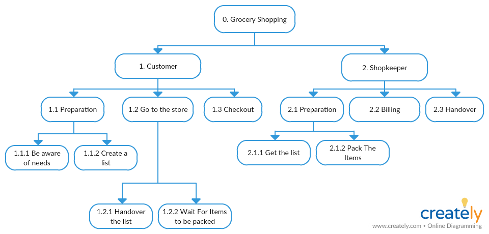
User Stories
Here are the list of user stories based on the above task analysis -
- * A user must be able to create a grocery list online. (Refer: 1.1.2). Thus reducing the chances of loosing or misplacing the list.
- * A user must be able to submit an order request online. (Refer: 1.2.1). So that when the user visits the store the items will already be packed.
- * A user must be able to schedule a pickup for the order online. (Refer: 1.2.2). Thus saving huge amount of time for the customers.
- * A user must be able to read a grocery order online. (Refer: 2.1.1). Thus reducing the chances of reading incorrectly or misplacing the paper grocery list.
- * A user must be able to know about when the pickup is scheduled. (Refer: 2.1.2). Knowing the pickup schedule will allow the higher priority orders to be completed first, thus increasing the overall efficiency of the whole process.
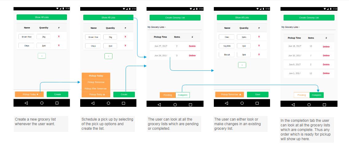
Wireframe
Design Iteration
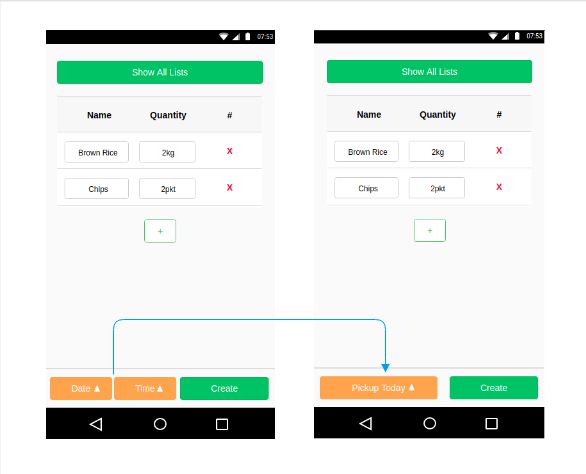
Making date time to be more readable -
By observing how users were fining the date time section confusing. They did not know what needed to be entered there. So I redesigned the whole section to more readable form.
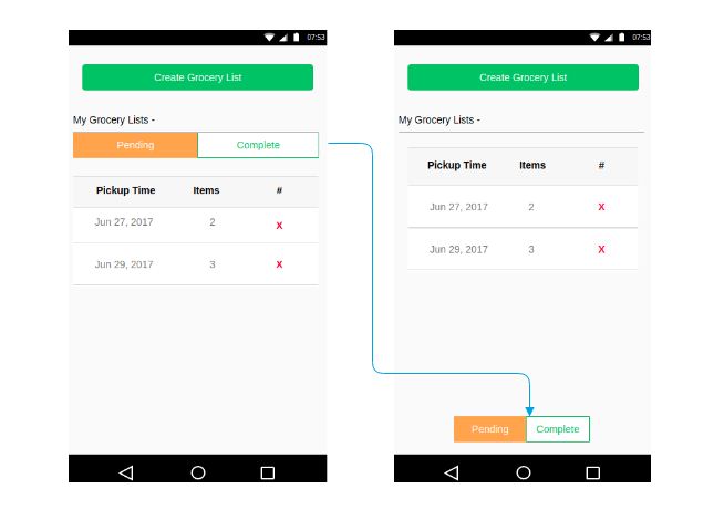
Making tabs more accesible -
By observing users behaviour, when they came to the grocery lists page, the tabs were not clear enough and uneasy to access. Since the switching of tabs would happen more often, I placed it more closer to the area where the interaction is most.
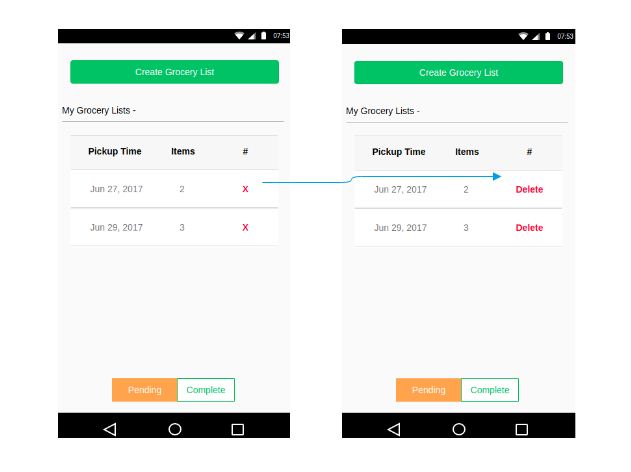
Making delete button more clear -
To keep the buttons consistent through out I had placed the same 'x' button for deleting any grocery lists. By observing the users, I realised that it was creating confusion about what exactly it was doing. So I had to explicitly say 'delete' in place of 'x'.